Thursday, 17 December 2009

Evaluation of the photos not used.

For the album cover and advert, I had a number of images to choose from. These, as well as the images I actually chose, were our top 5 images to use. I however, decided against these 3 photos.
This first photo is very similar to the image I used on the album cover. In the album cover image however, the artist has her head down, which links well to the theme of mystery we're trying to create with the masquerade mask and colour scheme. I preferred the expression on the other photo as this one looks a little depressing and doesn't create the mood I wanted to display.


 I had very similar reasons for not choosing the second photo as although it is clear and would create a good composition for the album cover, i felt it didn't portray enough mystery which would make it harder to link all 3 pieces together.  I also didn't like how the feet looked as if they were randomly placed behind her head. Although i would be able to cut them out, i felt the image i ended up choosing for my album cover would create a better effect.


For the 3rd picture the angle was different compared to typical pop album cover pictures that are usually used, which was why i was initially attracted to the picture. After considering the other images however, i decided that it wasn't clear enough who the artist was, and it was vitally important that the artist is seen clearly to promote her.

Wednesday, 16 December 2009

Evaluation

Jade Evaluation

Audience feedback

How the audience reacts to a media text is audience engagement. We need to take into consideration that different people will react in different ways to the same text which is why we have decided to have a preview screening of our music video with a focus group.


From this screening we have found out that......
We will therefore change our video accordingly focusing on....

Questions on blog and explanation on how you changed anything due to feedback.

Qualitative data- more personal and time consuming. The answers are more vague but detailed.

Quantative data- Quick and easy, answers are more precise, either a yes or no.

Advert


For my advert i wanted to keep a cohesive theme running from the album cover and digi-pak, to the advert so people can link each one to the other. This gives the viewer a theme to associate the album with which reinforces it in the memory. I kept the colour scheme the same throughout each piece, the dark red and black, connotating sexiness and sophistication which is what the album is trying to portray. The text is also the same, again providing that link for the audience and representing the sophistication of the abum. I used an interesting composition to make it more appealing to the viewer and the pose of the artist is a little different to the typical, face on picture that is predominantly used. By going against the typical pop conventions, it makes the whole album different and therefore more interesting to the viewer.

Monday, 14 December 2009

Digi-pak

Aswell as a music video, it was also required that I make a digi-pak containing what would be the cover of the album. I thought it would look more professional and tye the project up if i added the back cover and an insert in with this. From researching previous Britney and similar artists album covers I decided that the layout of the front cover should be relativley simple including a picture of the artist and the album and artists name. This would therefore keep text to a minimal leaving the picture as the main focus.


I decided on a deep red as the background of the album cover as it connotates sexiness and fun which relates back to the overall theme of the album. The deepness of the red gives it a sophistication as its almost wine like and the contrast of the background to the artist makes the picture stand out. The artist is wearing a mascarade mask which links to the album name and the stars which outline the right hand side of the cover could also help to portray this giving the cover a cohesive theme. The black and white font contrasts against the red background making it stand out, the black giving the cover an edge. This and the fact the artist is dressed in black gives the album a darker side which again can be seen as sexy and sophisticated. The font looks almost flirty and again, fits the theme of the overall cover.

For the back of the album cover, the main focus was the list of songs displayed along the left hand side. It was important that the font was big enough to be easily read and understood. I kept the same font as on the album cover to have an occuring theme throughout. The text fits in well with the edgy, mysterious theme which links well to the title of the album- the mascarade and the main image on the front (the artist hiding behind a mascarade mask.) All of these things portraying a sense of mystery that the audience wants to uncover. At the bottom of the back is the DVD and SONY logo and barcode which makes the overall package look professional. The writing at the bottom left are the names of the designers of the cover art and copyright standards. Again this makes it look more professional. Although its hard to see, there is a blended image of the artist in the background. Unfortunatley when uploading the picture the quality was lost and it's hard to see the image in the background, however the clarity is present using the photoshop software package i used to create thos. The artist however, is standing up and blends into the black background, again this representing a sense of mystery. The red spotlight and lines in the right top corner add colour and detail making it more interesting.

I wanted to keep the insert simple as the front and back cover of the album were fairly detailed. I have added reviews from NME, a music magazine viewed and brought by our target audience and Mojo music, another music magazine which targets our market. As our audience will be aware of these magazines, they're more likely to listen to what they have to say and take their opinions into consideration. The other review is by the guardian, which targets our slightly older market but again, is a well known paper whose views are considered by many people. Again the writing is the same as the front and back cover to keep it consistant and the mascarade mask at the bottom right hand corner reinforces the theme and title of the album. The red spotlight is similar to the one of the back cover and matches the colour of the front cover which again, displays a running theme throughout the three pieces. The spotlight also makes the background a bit more interesting, with the overall layout remaining simple.

Monday, 7 December 2009

Final Video

How we made our video..

Once we had filmed our footage we had to upload it to Adobe Premier Pro CS4, the software programme we used to edit our video.

This was the first time we'd ever seen this programme and when we first saw it, it looked far more complicated than it actually is. This is what we initially saw once we had opened the software.


After uploading our footage onto the software, the sequences come up in the left hand corner like this.....


We then dragged it onto the timeline to begin editing. Once we had done this it was important for us to load our song from a memory stick to itunes. We then imported the song onto the software and dragged the music onto the time line the same way in which we did the footage. We could therefore begin to edit our footage in time to the music.


If we wanted to select any section of footage, to either edit, move or delete it we used the Selection tool shown.


Once we had uploaded our footage we needed to cut it into frames. To do this we had to use the razor tool shown.


This was the outcome of cutting our footage into each single frame. As you can see, it comes up very small on the screen making it almost impossible to edit anything. We therefore had to use this


to enlarge the image and zoom into the clips, making it easier for us to edit the footage.


               Throughout the song there are times in which we felt the cuts had to be smoother. We therefore decided to use a video transition to create a cut from one frame to another smoothly and that also fits in with the songs tempo. We played around with all the dissolves, wipes, slides etc until we found one which suited our video best. To add this effect we had to drag the cross dissolve shown on the left, into the time line and onto one of our clips.


To add to the humour of the video we decided to reverse certain parts of the video to emphasise the 'drama' of a specific scene. This is shown in 'the push' and 'the trip' sequences. We found this a good way to make the video more exciting and individual and really reinforced the competition between the two girls. For various clips in our video we felt it appropriate for the video to speed up certain sections. Its noticeable mainly in the gym scenes as this helps to create an exciting and humerous atmosphere which is spot on for the theme of our video. Above is how we changed the speed of the clip and how we reversed it.

Monday, 9 November 2009

Todorov's theory

Todorov developed the theory of disrupted equilibrium. He identified that stories follow a typical pattern of;
- equilibrium = The 'status quo' where things are as they should be (calm period)
- disequilibrium = The status quo is disrupted by an event. (unsettlement and disquiet)
- equilibrium = This is restored at the end of the story by the actions of the hero. (renewed state of peace and harmony)

He then went on to progress on this theory;
1) A state of equilibrium at the outset.
2) A disruption of the equilibrium by some action.
3) A recognition that there has been a disruption.
4) An attempt to repair the disruption
5) A reinstatement of the equilibrium.

Our music video could be seen to follow the basic model of Todorov's theory. At the beginning of the video the two girls are seen walking together, talking and laughing which gives the impression of a possible friendship there. However, as the video progresses there are various scenes in which this friendship is disrupted. For example, when one of the girls is pushed into the bush by her 'friend' or which we would now class as 'competitor'. The state of equilibrium at the onset has been disrupted. At the end of the video however, although the competition for the guy is still taking place, another character is introduced. The boy picks her over the two girls leaving them together. This could be seen as a restoration of their friendship as the competition has been won, not by either of them, but by someone else. Their friendship can now carry on.

Friday, 6 November 2009

Music video campaign.

To be able to market our music video successfully, we need to advertise our product in a variety of ways. Although it is compulsory for us to make a CD cover and poster for our music video, we realise that to successfully sell our music video, we would have to add and link as many elements of a campaign together. It is vitally important that we have a synergistic campaign for all the elements to link together effectively. They must all have the same look, something that the audience can connect each element to each other, for example the same unique text.

The poster- This will sell the genre and create the right look that we are trying to sell. It's a teaser for the viewer and needs to catch the attention and interest of the public. These posters could be displayed in adshells or billboards which creates a wider audience.

Promotional interview- The artist featuring in chat shows. The artist could perform life on the show or a snippet of their track could be played during the interview. Again this will increase the amount of people that will be aware of the video and song and will hopefully increase the sales of the product. The artist could also have an interview on a popular radio station, the interview ending with the artist introducing their song to be played.

A spot- This is the time that we would buy to advertise the music video. This spot would be chosen with care as it would need to fit in between a programme that is typical for our target audience to be watching. For example displaying an ad in the middle of a midday children's programme won't be seen by our target audience and those that would see it; mums or young children, won't be interested. That would then be a wasted opportunity and a waste of money.

Thursday, 22 October 2009

Timetable

Tuesday 10th November
AIM: We have asked our actors to meet at 2.30 so we can begin filming our opening scene. Depending on how much footage we can get on this day and depending on the weather and setting we will also try to film the gym scene on this day too.
ACTUAL: Unfortunately the camcorder we had was unable to accept a tape so we had to go back to school and get a new one. By this time, it was too late to use the gym and the time we had left before it got too dark was limited. We did however shoot some footage in this time.
Below is the footage of our first filming. We have decided not to use this in our video as there is no continuity; it goes from light to dark whilst filming what was meant to be a 2 minute walk up the road. We did use this however to practice editing techniques and we learnt how important it was to get a variety of different camera angles whilst filming.

Friday 13th
AIM: To film the gym scene and the opening sequence.
ACTUAL: We managed to film a lot of footage for the gym scene and tried some new ideas out which could be used towards another scene for the video. We also filmed the 'bush scene', where one of the main characters is pushed into a bush by her rival. Unfortunatley we didn't have time to film the opening sequence aswell but as we filmed the 'bush' scene this wasnt too much of a problem.

Wednesday 18th
AIM: To film the opening sequence and 'the trip' scene.
ACTUAL: We filmed both of these scenes within the time we had and filmed roughly 15 minutes of footage to be used towards the opening and trip scenes.

Friday 4th December
AIM: To film Rosco walking out of his house in a number of outfits (roughly 6). Get at least two different angles of each outfit, altogether filming 12 frames.
ACTUAL: We managed to film this well and found some interesting angles which we could use when editing.

Propps theory

Propp (1895-1970) examined fairy tales in the generic for 'the folk wondertale'. He identified 8 character roles;
1) The villian
2) The hero- a seeker character motivated by an initial lack.
3) The donor- provides an object with some magic property.
4) The helper- aids the hero
5) The princess- the reward for th hero. The object of the villians schemes.
6) Her father- he validates the hero
7) The dispatcher- who sends the hero on his way
8) The false hero.

Propps theory is a form of structuralism, a view that all media is inevitably in the form of certain fixed structures. These structures are often culturally derived and from expectations in the mind of an audience from within the same culture. Eg- fairy tales always have happy endings, or the princess always marries the handsome prince.

Propps theory doesn't apply directly to our music video, as it is easier to link his theory to films or trailers than a music video. Although our video has quite a focused storyline, only 1 or 2 of Propps 8 character roles comply.
You could consider the male throughout the video to be the villian, womanizing and messing around with numerous girls. From this you could then take the girls in the video as the princesses as they're the object of the villians schemes (the boy is going out with all these girls and playing them off eachother.) The male, although considered powerful is also frowned apon by the audience whereas the audience will sympathise with 'the princesses' ( in this case the girls ).

Detailed storyboard

The video of storyboard in time to the music. Premier Pro.

Target Audience

The main demographic for our video will mainly be the fans of the artist- Britney Spears, females between 12-21 that were brought up in the western civilisation, mainly located in Europe, America and Australia. They will have an interest in pop music and will have knowledge of previous Britney songs and videos. As this song was vital to her comeback album, the video needs to be strong and memorable to reflect this important time of her career. Her main fan base would have previously been young teenage girls between the ages of 12-21. As however a great deal has happened to the artist between her previous career and her comeback, fans may have been lost and new fans may have been created. As her life was so publicly aired and shown throughout the media, people less likely to have listened to her before started to show an interest in her. This therefore means, this video does not only have to relate to her old fans, but to her new ones too. A lot of attention was put onto her comeback album so this video needs to not only be of a high quality, but show off the artist, the lyrics and the overall song. It needs to promote the artist in a positive way. Our audiences income and occupation will fit into the brackets D and E, regarding their ages (mainly the younger generation and students. Below are the Income Brackets that the industry target.

Income Brackets
A - Top management, bankers, lawyers, doctors and other professionals.
B - Middle management, teachers, many 'creatives' e.g. graphic designers etc.
C1 - Office supervisors, junior managersm nurses, specialist clerical staff etc.
C2 - Skilled workers, tradespersons (White Collars).
D - Semi - skilled and unskilled manual workers (Blue Collars).
E - Unemployed, students, pensioners, casual workers

Initial Ideas

We will try and include as many over the top situations as possible which will fit under the subtitles;
- 'The Meet'
- 'The Trip'
- 'The Push'
- 'The Muscle Man'
- 'The Fall' and..
- 'The ending'
We will use subtitles so the audience can understand the storyline and humerous theme of the video. We decided to use these as a light hearted, humerous introduction to each scene as the whole video is based around a fun, slightly exaggerated storyline. The aim is to edit our footage with regular quick editing to keep in time with the tempo of the song. The whole micky taking theme of the video will be it's unique selling point as it makes the video exciting and interesting to watch. The up beat editing and various scenes and settings will also make the video more appealing to the viewer.

Setting
The Gym: We rang up our local gym Lush to see if we were able to use their gym to film our gym scene. Luckily for us they agreed and this was a great setting to use as it looked professional and had a mirrored wall which made for interesting camera angles and compositions. We made full use of the equipment and tried to use the other gym users to our advantage to make the scene seem realistic.

For the majority of the other scenes we used local roads to film the rest of our footage. We tried to find quiet roads which we could use and for 'the push' scene we searched around for the perfect bush for our actor to be pushed into. We knew we wanted the roads to be typical of the outer London area so our target audience could relate to the video.

We will try and capture moments of the artist singing the lyrics to her song throughout the video as this helps to promote the artist and reinforces her status in the video. It's her song so it makes sense for her to be in the video. Although there is a lot of focus on the storyline of the song, which helps to promote the song, their also needs to be emphasis on the artist as the artist needs to be promoted too.

Camera Angles
We will try to use as many different shots as possible, from different heights, angles and points of views. We will try to capture unique and creative camera angles to ensure that our video is interesting and more exciting to watch than other pop videos that could be in competition with ours. As the video is based around a competition to win the attention of the male character, we will try to use the camera angles to display which characters have the authority and status at which time. For example, for the opening scene, as the male character is introduced coming out the car, we will try to include a high angle looking up at the male which represents he's the character with the power. These type of camera angles can be used throughout the video, the lower angles being used for the weaker character (the one that is loosing the 'battle' for the males attention) and the higher angles being used for the stronger character (the one that is winning the 'battle' for the males attention) at that time.

Editing
To be able to edit successfully and to our best ability we need to have enough footage so we can choose the best out of a variety of shots. If we have a lot of filming, were able to select only the best and the most relevant footage to use instead of having to use weaker shots because we don't have enough to fill the song. For the mouthing of the lyrics, sung by the artist, it is vitally important that the actor singing is 100% in time with the song so it looks natural and realistic. If the lyrics are out of time to the song, we won't be able to use the footage. We have decided that the best way to ensure this will happen is to play the music in the background when filming the lip-syncing so the actor mouthing the lyrics will know what part of the song they're at. We will use fast paced editing to meet the tempo of the music and will try to cut frames on the beat of the song so the video is at its most effective. This will help the video to flow and fit in with the song and also keeps the viewer interested in what they're watching.

Music
The music is from the artists new album 'circus' following her comeback album 'blackout' of 2008. The music is upbeat and we've found the tempo of the song relatively fast which is why our editing is also reasonably quick. We thought to help the video flow and to provide a link from the storyline to the music, that we should edit in time to the music cutting between frames exactly on the beat.

Special Effects
The only special effects we plan to use are ways to enter the subtitles. This could be with a dissolve, wipe, slide etc but we will try each one out and see which fits in best with the overall theme of the video. We will also speed up and slow down some sections of the video, for example when during the gym scene the pace of the running machine is being increased, this would look better if it was increasing faster and would add a more dramatic effect.

The chosen actors.
For our video we needed 3 main characters.
- The boy = who the girls are 'fighting' for. He is the 'womanizer' mentioned throughout the song. It was important that we found someone who was able to take the filming seriously to make the video look professional and realistic. We therefore chose Rosco, a good looking boy in our year who managed to keep in character throughout filming.


The girls = The two main girls are those in competition with each other in order to win the affections of the boy. Although other girls are included in the video, the main story line is based around them competing so it's important we find two girls comfortable enough with each other to perform competitively against each other in a professional way. We therefore chose two friends, Charlotte and Hannah, both who took drama at GCSE so are therefore confident and professional enough to pull off this act.


Storyboard

Opening scene

1)Establishing shot of girls walking down a street and a car going past. Pan slightly to follow the car. This sets the scene and introduces two of the characters.

2)'The meet' dissolves into the shot and out again. The two characters have walked a little further on and the car has also moved slightly.


3)Medium shot of the girls walking. This reinforces that these are the characters and again acts as an introduction.


4)Point of view shot- boy looking out of the car at the girls. The shot will be from inside the car.


5)Tracking shot following the girls (as if the boys looking at them). The boys head enters the shot towards the end, from inside the car.


Girls walking along, medium shot. Possible pan?


7)Medium close up of girls- shows their reaction to the entrance of the boy.


8)Car driving past, girls in the background. Long shot of the girls, gives the viewer and better understanding of what's going on by seeing the bigger picture. The car moves out of the shot at the end.


9)Boy inside the car. Close up of profile. An introduction to the boy. Immediate close up signifies his importance.


10)Reflection of boy in the wingmirror. Close up of his face. Different shot to make the video more interesting to watch.


11)Extreme close up of the cars indicator. Quick shot, gives the editing some pace, the flash of the indicator will match the upbeat tempo of the song.


12)Medium close up of boy getting out of car. Facing the boy straight on so although there's alot of the car in the shot, the boy remains the main focus.


13)Side angle, long shot. Boy getting out of the car (his foot hasnt hit the floor yet)

14)Close up/ extreme close up of his foot coming out of the car. Specifically cut on a major beat if possible. Door also closes at end of shot.


15)Boy out of the car, a long distance tracking shot. He walks away, throws his jacket over his shoulder and locks the car. The girls enter the shot where the circle and arrow is at the end of the shot.


16)Medium shot of boy, he's in the front of the shot. Where he's bigger and clearer to see it makes him the main focus of the shot even though the girls are in the background. They're there so we can see their reaction and see the scene from a distance.


17)Medium close up of the girls, emphasises their reaction.


18)Camera behind the boy as he walks away. He walks out of the shot.


The 1st Gym Scene (The muscle man)

We found it hard to plan this scene because we were unsure of what would be available and the camera space that would be free to use as we were unaware of other objects or people that would be in the gym on the day of filming. Although we went to the gym to check out the setting and to make sure it was suitable, these things were out of our control and we had to wait until the actual day to find out what we could work with. We have therefore not planned this scene in as great detail but we do plan to film a variety of angles of the actors on gym equipment.

The rest of the storyboards below wont be shown in as much detail as the opening scene as it took too long to upload every picture and took up too much space. I will therefore show the storyboard in sets of 6 frames and write about each main point underneath.

Wednesday, 7 October 2009

The storyline of our video

"The set of all the events in the narrative, both the ones explicitly presented and those the viewer infers, compose the story."
Bordwell & Thompson

The video is going to be based on the relationship between a boy and two girls and the extent that girls will go to to receive attention from the male gender. This relates back to the songs title- womaniser and reinforces the lyrics to the song. The video will include typical conventions that are found in pop videos and exagerated acts to gain attention. As the target market of this video is most probable to be teenage girls they can relate to the video and will understand the humour of it. Similar to Pinks- stupid girls video, the scenes re-created in the video will be over the top and extreme to make the video interesting and amusing to watch.
The narrative of our story fits in with some of Roland Barthes 5 action codes, which enable an audience to make sense of a narrative. The 2 concepts the video meets is;
Hermeneutic (narrative turning point)
The story line is one that we are familiar with, the typical girls chasing boy scenario. Because we are known to this type of narrative (intertextuality) the viewer knows where the story will go next. We will use this action code to our advantage and follow this theme up to the end of the video. At this point the viewer is pretty much positive that they know what will happen as this has been the case for the whole video. However at the end of the video we will surprise the audience with something they don't expect to happen. We will then be following Levi Strauss's concept of bricolage where we will use the process of 'deletion'- taking something typical of a genre out.

Monday, 28 September 2009

Analysis of Alesha dixons album cover

Photobucket

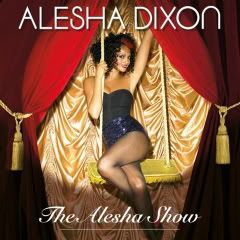
This is the album cover for Alesha Dixon's album 'The alesha show'. The overall theme of the album cover reflects the name of the alubm. 'The alesha show' refers to a show; a westend theatrical show in particular and the colours and costume used in the cover portrays this theme of theatre well. The image of her is set in front of a gold backdrop with red curtains. This is typical of the beginning of a show, the glitz being represented through the gold backdrop and the deep red of the curtain. A spot light is shown lighting up the artist making this the focal point of the cover, the first place we look when we see it. It also helps to represent the show theme that is being portrayed in this album cover. The name of the artist is placed at the top of the cover in white capitals, which contrast against the red and gold background making it stand out and be read easily. The text is plain and simple so it can be clearly seen and read. The title of the album is written at the bottom, again in white as it contrasts against the background but it written in italic and is underlined. Although this makes it stand out as the text is different, it is also smaller so the text doesn't distract the viewer from the main image.

Analysis of Britney Spears's album cover

Photobucket

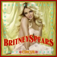
This is the album cover for Britney Spear's new album; 'circus'. The background of the cover is a gold curtain to portray the circus theme of her album. It's outlined in red, green and gold lines, again these colours are typical of the circus and help to reflect the theme. These colours contrast against the light gold curtain and make the overall album cover stand out. The main image is of Britney Spears herself and is a medium close up in the middle of the cover making it the main focus. Her face and overall appearance is happy and innocent to create a sellable image and to attract the audience to the album. Light blue stars also outline the cover which represents the glitzy image of the circus which is matched by the powerful colours of red and gold. Her name is written in bold to make it stand out and is in red which contrasts against the gold making it 'pop' out. It is placed across the cover, again making it eye catching for the viewer. The album name is written in gold capitals at the bottom of the cover in between two fancy symbols which are in red. Both the gold and red contrast against the white background it is set in front of making it stand out so it can be easily seen. It is of reasonable size as to not distract the viewer from the main image which sets the overall theme of the album.

Analysis of Pixie Lotts album cover

Photobucket

This is the album cover for Pixie Lott's new album 'turn it up'. The cover layout is very basic, a medium close up of the artist in the middle of the cover with her name written beneath her. There is no theme or real background to the cover yet it is still affective and eye catching. The photograph of the artist takes up the majority of the cover and is centred for it to be the focal point, drawing the fans attention immediately to the cover. The artists name is placed below her in a fun, bold font in white which contrasts against the background. The contrast of the colours makes it stand out and the quirkiness of the font also helps reinforce this. The blending of the colours behind the artist creates a light behind her making the photo stand out as it is in contrast to the background. The blend from dark to light draws the eye to the centre where the lighter colour ends behind the image.
Mood Board of pop artists


From looking at these typical, female pop artists i have gained ideas and inspiration, using their music videos to get a better understanding of what a conventional pop video is. These are all album covers of successful female artists and I will use these when producing my own album cover. I aim to use certain themes and techniques that are displayed in these covers for my own creation (intertextuality).

Choosing our song

In order to choose a song and artist for our video we had to decide first on a genre. To help us with this I created a poll on my blog with the options of various genres and asked the public which genre they prefered. The majority of the public's favourite was pop and as it is also mine and Jemma's prefered music genre when considering music videos we decided to start looking at pop artists.

We looked closely at various artists and picked out the usual conceptions and typical behaviour shown in the pop videos. We couldn't however decide on a song as we wanted a strong story line to go with the song.

We then decided to look closely at Jilted Johns- Gordon is a moron as the lyrics of the song can be taken so literally it would produce a funny and interesting video. Although the genre of music isn't pop, the genre we originally decided to focus on, we could include typical pop concepts that are seen predominantly in these videos to link to the pop genre. Below are the lyrics of the song to show how simple they are and how they can be taken so literally but can be exaggerated in a humerous way.


After listening to various songs by different pop artists and from the results of our 'who is your favourite female pop artist at the moment' poll we have decided to create a music video for Britney Spears 'womanizer'. We thought that the lyrics and overall up beat tempo of the song would make for an exciting and interesting music video. After considering the Jilted Johns video we decided against using it due to its punk genre and the fact it is such an old song. Although we had some good ideas for this video, the overall idea for the womanizer video was stronger and fitted in with the pop genre. We have decided to take the meaning of the song literally, using typical concepts of pop videos and exagerating them to create a humerous music video. We shall try to include some of the context seen predominantly in similar videos, for example; in Pink's stupid girls video the characters are taken to the extreme; extreme make up, hair etc.

Thursday, 24 September 2009

Focused anaylsis: locations

Focused analysis: characters


I've decided to use this song to analyse the characters that are represented in this video. It begins with the intorduction of a 'geeky' girl wearing her glasses and reading in her room, predictable costume and prop to make it clear to the viewer what the character is like. The guy she's admiring is again typical to the pop genre and the high school scene- the preppy 'heart throb'. Already there's a distinction between the characters and from previously watching chick flicks and similar videos, the viewer understands the natural barrier between the two characters which is displayed through the walls and space between their houses. As the story progresses along with the song another character is added- Taylor Swift acting as the boys girlfriend. The two girls are portrayed with the way they dress, the 'geeky' girl in sensible clothes and light colours; white and cream to reflect her innocence and the girlfriend in more revealing, darker colours for example red to portray the enemy, the devil. From the costume and their appearence there is a clear competition/rivalry between the two which is shown through their differences. The obvious way each character dresses, the different colours they wear and even their hair colour contrast against each other. This contrast symbolises their rivalry. The characters are used predominantly in this video to tell the sotry of the song. Without the characters and what they represent there would be no storyline, the characters help us to make sense of the video.
Focused analysis- camera angles and editing


I decided to look at Pixie Lotts- boys and girls music video to focus my analysis on camera angles and editing. Her video hasn't really got a story line and the narrative is quite basic. The camera angles and editing therefore need to entice the viewer and make the video interesting to watch. The video is made up of a variety of shots, establishing shots at the beginning to set the scene, long distance shots so the viewer can see her dancing, panning shots to follow her actions, close ups, medium close ups and extreme close ups to focus and emphasis certain expressions, objects and costumes. There are quite a few long shots shown throughout the video, each one pausing for longer than usual to show the viewer the artist dancing. The video follows a pattern and for the majority of the video, once a long shot has been used, a close up will follow of the artist to emphasis this is her music video. The extreme close ups and close ups are used to show her singing the song, again this reinforces the artist so it is clear to the viewer who the artist is. Around 0.32 seconds, the director uses a cut away shot to the beat of the music; another way to make the video more interesting. Just before and during the chorus the tempo of the music speeds up and this is matched by the editing; for example 2.05 and 2.28 of the video. The editing is smooth throughout the video and although it pauses for the long shots, the rest of the editing is relatively fast to make the video more interesting and exciting to watch.

Analysis of Stupid Girls-Pink


Song- Stupid girls
Artist- Pink
Director- Dave Meyers

Target Audience
The core audience of the music video would be fans of the artist, specifically teenage girls with an interest in pop music. As the video tells a great deal about the artists opinions and views on the new generation it has become subject of many debates attracting larger audiences that might not have necessarily seen the video previously.
Narrative Structure
The negatively portrayed characters in the video are parodies of young female celebrities today. The video reflects the lyrics in which it deplores the lack of good role models for girls whilst encouraging them to cultivate their own independence and individuality. The video highlights the culture's unrealistic pursuit of thinness and drive for physical beauty. The video shows the artist, Pink, as an angel and demon trying to influence the future of a young girl. The angel and demon demonstrate two different directions the young girl can take and will be looked at further in the 'characters' section below. The narrative for this music video fits under one of Roland Barthes 5 action codes, which enable an audience to make sense of a narrative. It meets his 3rd action code; cuttral (prior social knowledge) for example it reflects our attitudes to gender- the scene of pink dancing in a 50 cent video and the stereotypes of "the stupid girl".
Setting
There are numerous locations in this video, each one representing a point that the song is trying to make. For example one of the settings is the artist, pink, dancing in a 50 cent video. Most people are familiar with the female extras in rap videos and this particular setting is a portrayal of women as a sexual object which is seen predominantly in rap videos. The video uses the setting to emphasis the views of the artist and the point that is being put across. The different situations and dramas shown through the setting are displayed as humorous and making fun of certain celebrities. For example; the scene in the tanning salon is over the top and is humorous to the audience as it has taken a normal situation and exaggerated it. The basic spray tan basis is popular for teenage girls, which happen to be the main audience of this video. The viewers can therefore relate and understand the video and the points that are trying to be made. The producer focuses on the situations being slightly unrealistic and exaggerated as it's more entertaining for the audience and reinforces the point of the video.
Characters
The artist plays various characters in this video, all of the characters representing one of two groups; characters that represent the "stupid girls" and the characters that are the opposite of this. She is shown in numerous roles some of which include; a dancer in a 50 cent video, a girl at a tanning salon, a girl attempting to attract the attention of an instructor at the gym and a girl getting plastic surgery. All of these characters fit the "stupid girl" title and are portrayed negatively and are parodies of young female celebrities. The characters playing the opposite of the "stupid girl" are; a finishing school teacher, a female president and a girl winning a game of football. These are displayed as positive characters and the end of the video shows the young girl picking a football over make up and dolls. The demon is defeated.
Costume
The outfits worn are typical costumes of young girls and celebrities. A lot of pink, glitter and fluffy items are used to reflect the girly impression of the "stupid girl". Handbags, sunglasses and statement jewellery is seen predominantly on the characters representing the "stupid girls" and suits, glasses and neat and tidy hair is seen on the characters playing the opposite. All of the costumes are typical of the characters being portrayed. This is known as intertextuality as it's recreating the look and scene's that are typical of each character.
Lyrics
The lyrics are powerful and strong and tell the points that are being put across by the video, the lyrics reflect the video. The video follows the songs lyrics to emphasis and reinforce the points that the lyrics are talking about. The lyrics make the point and the video merely shows the point visually, the lyrics are mirrored by the video. The lyrics where inspired by the lack of good role models for girls while encouraging them to be independent and individual. The song lyrics help to highlight points such as,' the culture's relentless and unrealistic pursuit of thinness and unattainable drive for physical beauty'.
Special effects
There aren't many special effects used in this video. The main effect used is the floating demon and angel which represent the two directions the young girl can take. These are made to float in the air, with just there heads shown as demons and angels don't exist. They're fantasy characters taken from inside the girls head and the special effects help to portray this.
Camera angles and editing
The video displays a number of shots varying from establishing shots to set the setting for each scene, close ups to emphasis certain points, medium close ups, extreme close ups, high and low angles to demonstrate the more powerful and the weak and panning and tracking shots to follow the action of the video. The editing is of a reasonable pace and the camera shots are long enough for the viewer to understand what the image is representing. It isn't however too slow so keeps the viewer interested and compelled to carry on watching. There are sections of faster editing that match the pace of the song, for example 1.08-1.10. In the space of these 2/3 seconds there are 5 different shots which match the tempo of this certain section. As the video is based around telling the viewer a story and is reinforcing a point with each scene, the shots are relatively slow compared to the up tempo music. This is so the story can be clearly seen and understood and the humour of the video can be recognised.

Analysis of Sabotage- Beastie Boys


Song- Sabotage
Artist- Beastie Boys
Director- Spike Jones

Target Audience - The core audience of the music video would be fans of the band and they would be similar ages to the band members. The majority of the fans of the band would be males
Narrative Structure
Pastiche of a typical American show; Starsky & Hutch, Dukes of Hazard etc. Its portrayed as a cops v robbers crime show with no constant story lines but short, sharp different plot parts which are broken up. It doesn't follow a classic narrative which was dictated by "Propp".
Setting
There are dozens of locations which results in a numerous amount of spoofs that can be shown. This makes the video more entertaining and exciting for the viewer. The different situations and dramas shown through the setting are displayed as unrealistic and humerous. The audience can therefore relate and understand the humour and plott of the music video. The producer focuses on the situations being unrealistic as it's more entertaining for the target audience to see the band act out the situations drastically.
Characters
The characters are made up from the band members which is what the audience are expecting and want. Its meeting viewers expectations, this is a clear convention of this type of genre.
Costume
Moustaches are worn, big side burns are see combined with big hair, smart suits and sunglasses- all of these things relating to the 70's and are typical of police officers in this era and type of genre. This is known as intertextuality as its recreating scene's of a crime show genre.
Lyrics
The lyrics are powerful and strong which reflects the action theme and overall genre of the video. The video doesn't follow the songs lyrics word for word but is portrayed through the feel of the song and the way it's sung. The strong lyrics are mirrored in the strong action related video.
Special effects
The special effects are poor but are done this way purposely to again, reflect the american crime shows that were present in the 70's. The random explosions fits in with the cop show theme and the man falling off the bridge is a dummy witch re-enacts the spoof.
Camera angles and editing
The pace of the video matches the tempo of the song which matches the spoof american crime shows. For example; the tacky captions that are used throughout the video. There are a variety of shots, distances including crash zooms and fast editing. This keeps the audience interested and excited. The music follows the action, as the music slows down the shots slow down too. This reinforces the match of editing to the tempo

Wednesday, 16 September 2009

Coursework options and the outcome of these.

For my A2 coursework I had the choice between creating a promotion package for the release of a new album or a promotion package for a new film. The package for the new album includes a music promo video, a cover for it's release as part of a digipak (CD cover) and a magazine advertisement for the digipak. The package for the new film includes a teaser trailer, a film magazine front cover featuring the film and a poster for the film. For this particular project I was told that we had to work in groups to produce all of the aspects of the coursework and i have therefore decided to work with one of my close friends. We have similar taste in music, the genres and artists and can talk well to each other making comprimising and communicating easy so hopefully both our ideas can be incorporated into one project. Together we have decided to produce a music video. I enjoy listening to music and to see how a director interprets the song and the lyrics that go with it. I would therefore like to show others how i have interpreted a piece of music by creating my own music video using other similar genre videos to influence me. My blog is designed to follow the progress of my media coursework, posting videos and images that have helped me to progress whilst producing my music video. I will talk about these videos and images that have influenced me and the ideas i have gained from them.